| Table | Displays raw data in a structured format, ideal for precise values and detailed comparisons. |
| Pie Chart | Best for showing proportions within a whole, where each slice represents a percentage of the total. (Consider using for 5-7 slices maximum.) |
| Funnel Chart | Illustrates how values progress through different stages of a sequential process, often used to visualize conversion or attrition rates. |
| Bar Chart | Useful for comparing quantities across discrete categories, with the length of the bars representing the values. |
| Bar Chart (stacked) | Displays multiple data series in a single bar, where segments within the bar show the contribution of each part to the whole. Useful for comparing sub-categories and their cumulative totals. |
| Bar Chart (100% stacked) | Similar to a stacked bar chart, but each bar represents 100% of a category, with segments showing the percentage contribution of subcategories. Ideal for showing part-to-whole relationships and how proportions change over time. (Be cautious as overall totals are not explicitly shown.) |
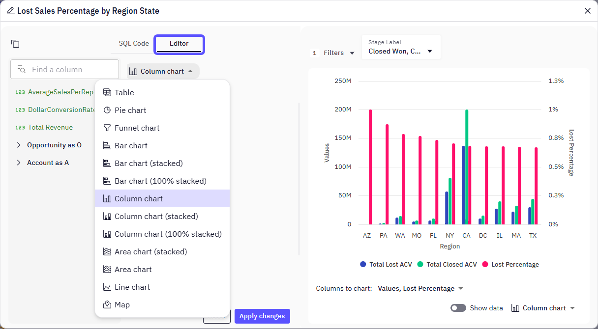
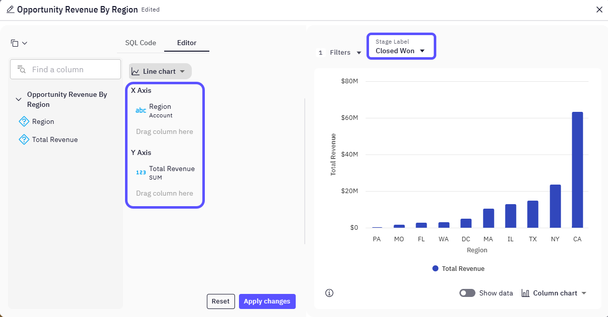
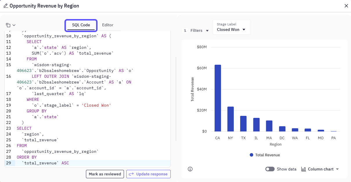
| Column Chart | Visually represents numerical values using vertical columns. Ideal for comparing discrete categories, often with the height of the column corresponding to the value. |
| Column Chart (stacked) | Presents multiple data series as vertical bars, with segments stacked to show their cumulative sum. Aids in comparisons between categories over time or across different groups. |
| Column Chart (100% stacked) | Compares multiple measures by stacking bars vertically, where each segment represents the percentage of the overall category total. Useful for showing the distribution of components within a whole at a specific point in time or across time. |
| Area Chart (stacked) | Shows data as an area under a line that connects data points, with multiple series stacked on top of each other. Useful for displaying the contribution of different components to a whole while showing overall patterns and cumulative trends over time. |
| Area Chart | Visualizes quantitative data and shows how values change over time, with the area between the line and the baseline filled with color. Ideal for emphasizing trends and the magnitude of change. |
| Line Chart | Ideal for displaying trends over time or across continuous measurements, showing how data changes and identifying patterns. (Excellent for time-series data.) |
| Map | Transforms geographic data into visual insights by displaying information across different regions, countries, or territories. Useful for visualizing spatial patterns and distributions. |